The Big Issue - Cover Analysis
The colours used on the cover of this magazine would be very appealing to an audience
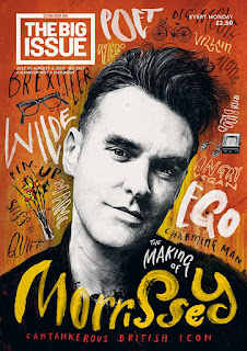 as the colours are very bold and colourful. Compared to many magazines already out there the front page is very different to a mainstream magazine. This is in the way that the front page displays a lot of art work and not mainstream stuff such as social issues. This front page appears as if a lot of work and appreciation has gone into it. The audience would be attracted by the time and effort gone into creating the art work on the front page and they would share the editors appreciation. The different fonts surrounding the illustration draw attention as they make up for the background of the front page. The larger words in white stand out most which may imply that they are more important or more relevant to the stories being told. The majority of the audiences attention would be drawn towards the large illustration of Steven Patrick Morrissey. The attention is mainly focused on this illustration as it uses a large amount of space on the front page. This suggests to the audience that the main topic of the magazine in this issue is 'The making of Morrissey.' The illustration of Morrissey shows him at a younger stage of his life which matches up with the title underneath the illustration. 'The making of Morrissey, This suggests that we will be given information on Morrissey's journey through his life and we will get to know what went on during the making of his career. Morrissey was a well known singer, songwriter and author. As he had many talents the making of his career would be very appealing to many of his fans or anyone with the same ambitions and goals as what Morrissey had at the beginning of his journey. The word Morrissey stands out clearly as the colour is very bright and bold. This may have been done to target Morrissey's fans. The boldness of the word would have drawn in the attention and the audience would have began to then look around the whole front page. The artist who has created the illustration of Morrissey has gone into a lot of detail. The creator shows great appreciation towards Morrissey which suggests that the creator wants his audience to appreciate and respect Morrissey as much as what they do. The illustration being in black and white really emphasises all of Morrissey's features and it really concentrates the audience on his face as there is many features to focus on.


 as the colours are very bold and colourful. Compared to many magazines already out there the front page is very different to a mainstream magazine. This is in the way that the front page displays a lot of art work and not mainstream stuff such as social issues. This front page appears as if a lot of work and appreciation has gone into it. The audience would be attracted by the time and effort gone into creating the art work on the front page and they would share the editors appreciation. The different fonts surrounding the illustration draw attention as they make up for the background of the front page. The larger words in white stand out most which may imply that they are more important or more relevant to the stories being told. The majority of the audiences attention would be drawn towards the large illustration of Steven Patrick Morrissey. The attention is mainly focused on this illustration as it uses a large amount of space on the front page. This suggests to the audience that the main topic of the magazine in this issue is 'The making of Morrissey.' The illustration of Morrissey shows him at a younger stage of his life which matches up with the title underneath the illustration. 'The making of Morrissey, This suggests that we will be given information on Morrissey's journey through his life and we will get to know what went on during the making of his career. Morrissey was a well known singer, songwriter and author. As he had many talents the making of his career would be very appealing to many of his fans or anyone with the same ambitions and goals as what Morrissey had at the beginning of his journey. The word Morrissey stands out clearly as the colour is very bright and bold. This may have been done to target Morrissey's fans. The boldness of the word would have drawn in the attention and the audience would have began to then look around the whole front page. The artist who has created the illustration of Morrissey has gone into a lot of detail. The creator shows great appreciation towards Morrissey which suggests that the creator wants his audience to appreciate and respect Morrissey as much as what they do. The illustration being in black and white really emphasises all of Morrissey's features and it really concentrates the audience on his face as there is many features to focus on.
The front cover of this gives the audience a fairy-tale feeling. This front cover would target an audience who appeal to the idea of fantasy and make-believe. The main feature on the front page is the stars of the new remake film of beauty and the beast. The photo shows the stars o00f the film and underneath it is stated clearly. Beauty and Beast are together and being shown is the well known scene in the film of them dancing in the ballroom. The editor of the big issue has possibly used this picture from that specific scene as that is the well known part of the fairy-tale. From an audiences perspective it would allow them to picture that scene from the movie. This would attract the audience to look at the magazine closer to appreciate the other details around Beauty and Beast. The stars names Emma Watson and Dan Stevens are very bold and clear. This would attract fans of Watson and Steven and encourage them to want to read on and read the interview that is featured in the issue. The magazine is also promoting the film as the film is used on the front cover. This allows the audience to be informed of the film that has came out in cinema. This would bring In customers for cinemas. The colours used on the front cover are very bold and eye catching. The bright yellow colour of the dress contrasts nicely with the dimmed brown background colour. The lights are bright and they reflect off the dress and it emphasises the beauty of the dress. There are bright sparkles on the front cover which appear like they are floating around like magic. This gives the front page a magical look. The magic surrounding beauty and beast is wrapping around which suggests there magical love.

The front cover of this issue features an interview with Liam Gallagher. The first thing that grabs the attention of the audience is the main visual image of Liam Gallagher. This would grab the attention of Liam Gallagher fans straight away as the picture is so large and eye-catching. The colours are bold and very different. The main colours are bright pink used on Gallagher and a light turquoise used as the background colour. The colours are effective as they compliment each other and they do not clash like you would think they would. The turquoise background colour matches with the colour of Gallagher's eyes and the colour of his jacket matches with his lips. This makes the front page appear more organised an brings everything together. This is what allows the colours to work and compliment each other. The title 'Liam' is very bold. The white colour of the name matches with the logo of the big issue. This also helps to brings the colours together. The features on Gallagher's face are really emphasised and precise. The expression is very dull on his face he doesn't show much happy expression. The background colour expresses a different emotion compared to expressions shown on his face. This may suggest that the front cover is expressing feelings he doesn't usually show the audience.
Comments
Post a Comment